Layout Builder allows content editors and site builders to easily and quickly create visual layouts for displaying content. You can customize how content is arranged with an easy to use drag-and-drop interface. Layout Builder replaces Drupal 7's Panelizer.
Layout Builder Overview
In Drupal 7, you may have noticed that Panelizer only allowed you to have one layout per page - and all of your content needed to fit into those boxes. With Layout Builder, there is no limit to how to display your content. You can have a different layout for each section of your page, allowing you to present your content in beautiful, scannable arrangements.
Layouts
There are over 40 different layouts to choose from. These layouts can be used as a full-page layout, or you can have a different layout for each section of the page.

You may notice that some of the layouts look very similar. For example, Bryant/Bryant Flipped look almost exactly the same as Burr/Burr Flipped. While they are essentially the same layout with a wide main content panel and a sidebar, the widths of those columns are different. You should select the one that works best for your content. Below is a comparison of the two layouts.

In this example, we would recommend using the Burr Flipped layout because the column is wider, allowing the text to flow better and is easier to read.
Components
A web component is like a Lego for the web. It is a building block to customize the look of your website and can be used to enhance your content strategy. To add a component to a webpage, it will need to be done on the Layout Builder screen.
Folwell Web Components
These components are part of all Drupal 9 websites using the Folwell web theme.
Accordions
Callouts
Image Slideshows
Link List
Tabs
Transparent Image Overlay Callout
University Relations Web Components
These components were developed by and only available on University Relations websites. When you add them to the website, they will be listed under Folwell Components in Layout Builder.
THESE PAGES NEED TO BE CREATED AND LINKED TO:
Button Group
Colorblock
Image with Text
Infographic Group
Multi-image Group
How to use Layout Builder
By default, the Basic Page content type is just one column wide and one row tall—essentially, one single “block” of content. If your web page has more than one column, you will need to edit your web page with the Layout Builder found on the Layout Button. You can add rows, referred to as sections, and each section can have it’s own layout with columns of different sizes.
Adding a new section
- Open the Basic Page you wish to edit
Click on the Layout button at the top of the page
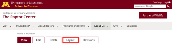
Your page should look similar to this
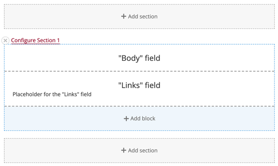
You will be using two buttons within Layout Builder: Add section and Add Block.
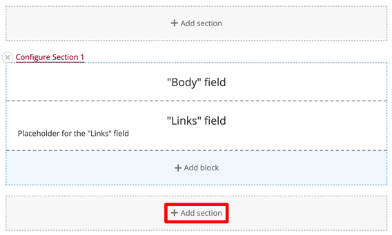
To add a row of content, click on the Add section button
Selecting a layout
Once you click the Add section button, a new menu will appear on the right side of the screen. This menu shows all of the layouts you can choose from for this section/row of the web page. Be sure to scroll down—There are many layouts to choose from!
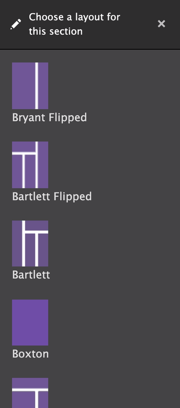
When reviewing the available layout options, look at the purple and white layout previews to see how many columns the layout will have and the size of those columns. Think about how your page’s content will need to fit into them and select the one that best fits the needs of your content.
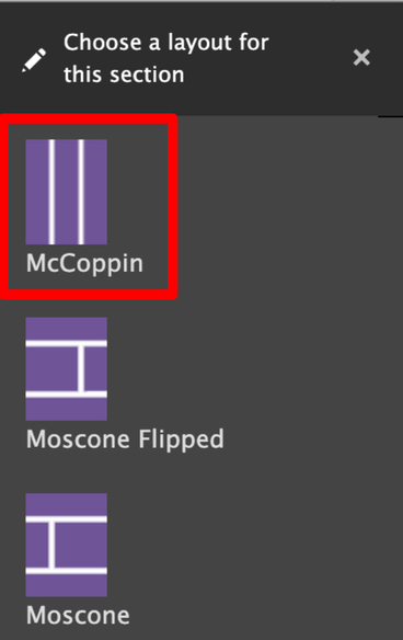
Click on the layout you want to use.
In this example, the McCoppin layout is used.
Optional: Naming the section
After you select your layout, a new screen will appear in the right sidebar that looks similar to this:
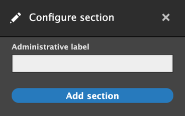
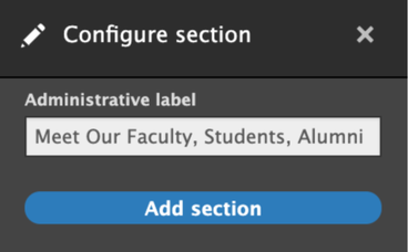
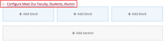
Naming the section is optional. You can leave it blank and click the Add section button, or you can label it as a reminder of what content you want to put in this section. It will not affect the display of the website to visitors, but will show a label when you are editing the page, like this:
Adding blocks to a section
A block is a piece of content that can be placed into a section. Most of the time, it will be a Folwell component, such as: accordions, callouts, images, and slideshows.
Within the newly created section, pick a column you want to add content to and click Add block

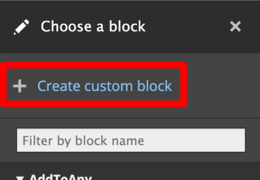
Select Create custom block, found at the top of the list of blocks displayed in the right-hand column. The Folwell components are located in this section.
- Select one of the following:
Basic block
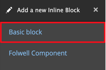
A basic block is a text box with the WYSIWYG options
Folwell component
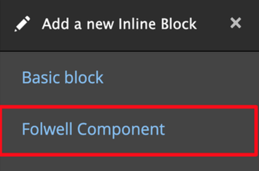
A Folwell component adds any of the special Folwell components including accordions, callouts, images, and slideshows.
Note that although each block requires a title, you can control the appearance of this title with the “Display title” checkbox located within the block.
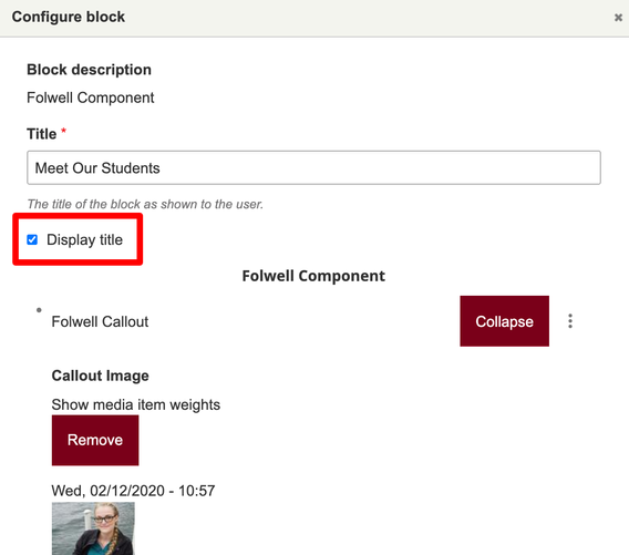
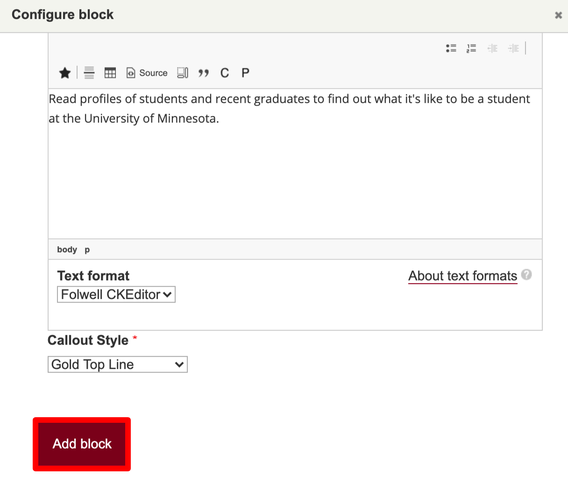
Add your content and select the Add Block button.
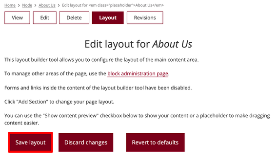
Scroll to the top of the page and select the Save layout button.
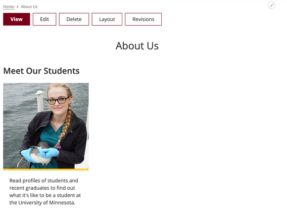
You can now preview the new page layout and content that you’ve created!
Rearranging Sections
You cannot change the order of sections.
- To move a section of content on a page, use the Add section button to create a new section in the desired location.
- Once the section and layout have been created, drag and drop your existing content blocks to the new section’s content columns.
Deleting Sections
To delete a section and all of its content, follow the steps below.
Note: This action can not be undone! Content will be permanently deleted.
- Locate the section of content on the page that you want to delete
Click the X button next to the section name
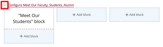
- A menu will appear on the right side of the screen confirming that you want to delete the content.
Click the Remove button to delete the section and its content
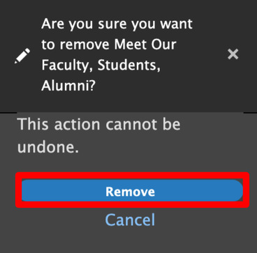
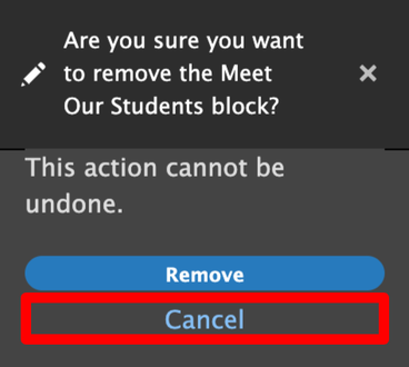
Click the Cancel link if you wish to keep the section and its content
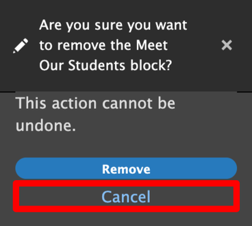
Rearranging Blocks
Uncheck the Show content preview box found under the Save layout button at the top of the page to make this easier.
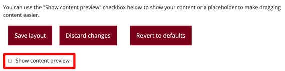
- Grab the box of content you want to move and drag and drop it to its new location.
Deleting Blocks
To delete a block, follow the steps below.
Note: This action can not be undone! Content will be permanently deleted.
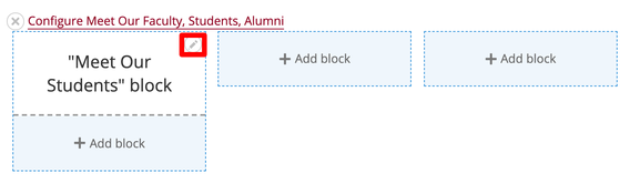
Hover over the block you want to delete. Click the edit icon that appears in the upper right corner.
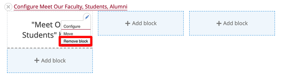
Select Remove block from the dropdown menu
- A menu will appear on the right side of the screen confirming that you want to delete the content.
Click the Remove button to delete the section and its content
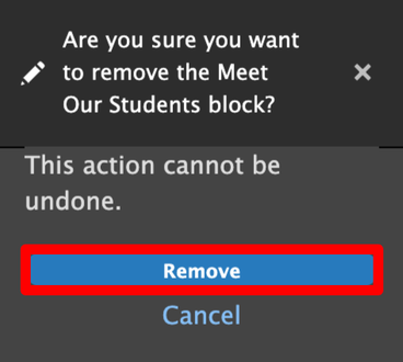
Click the Cancel link if you wish to keep the section and its content