You need to update your Drupal website, now what do you do? We cover the basics of updating your website on this page.
Logging In
Log in to your website by adding “/saml_login” to the end of your homepage’s URL, such as www.yourwebsite.umn.edu/saml_login. Your screen will look similar to this:
As the web editor for your website, you should already have editing access. If you do not have access, email urweb@umn.edu.
If other staff in your department need to edit the site, have them follow the same login process, then send an email to urweb@umn.edu asking us to grant them access.
Creating a Web Page
To create a new web page:
- Select Content from the top menu, continue to select Add Content from the drop-down menu, and then select “Basic page.”
- Once the page template appears, enter the title of your page.
- You are now ready to enter the content to your page.
WYSIWYG Toolbar
The WYSIWYG toolbar is used to format text, add styles, lists, horizontal lines, links, images, tables, quotes, and callouts. The following list identifies the action associated with each icon in the toolbar, the links take you to the Folwell page for the design component containing examples and usage information.
Undo/Redo arrows = Undo your most recent action, or reverse the undo action
B = Bold
I = Italic
X2= Superscript
X2= Subscript
Tx = Remove formatting
𝛀 = Special characters
Format = Select a header (H1, H2, H3, etc.)
Alignment = Left, right, center, or justify
Styles = Select intro text, photo credit, or button style
Link icons = Add a link, or remove one (link icon with an X)
Anchor link flag = Add a link that points to content on the same page (see Adding Content to a Basic Web Page)
Bullets = Create a bulleted list
Number list = Create a numbered list
Decrease/Increase indents = Create indented bulleted or numbered lists
Star = Insert media file, such as an image or document
Line = Insert a horizontal line
Table icon = Insert a table
Source = View HTML code
View blocks = Allows you to see formatting (e.g., callouts)
Quote icon = Block quote. Highlight the text and click the icon.
C = Callout
P = Pull quote
Adding Content to a Basic Web Page
By default, the Basic Page content type is just one column wide and one row tall—essentially, one single “block” of content. Use Layout Builder to change this and completely customize a page.
To edit your web page content in Drupal use either the Edit button or the Layout button. A good rule of thumb is to check the Edit button first and, if your content isn’t there, proceed to the Layout button.
Adding Content with the Edit Button:
Use the WYSIWYG editor to format text, add links, images, callouts, or other simple design features.
Note: Make sure you scroll to the bottom of the page to save your work.
Using Anchor Links
An Anchor Link is a link that points to content on the same page. Anchor Links are typically used on long, text-heavy pages. You can think of them as “Jump-to” links. When clicked, they will “jump to” the specified content on the page.
Getting Started
- Create a Basic Page and enter all of the text into the Body field.
- Be sure to structure your content using the proper Heading tags, as this is what we will be linking to.
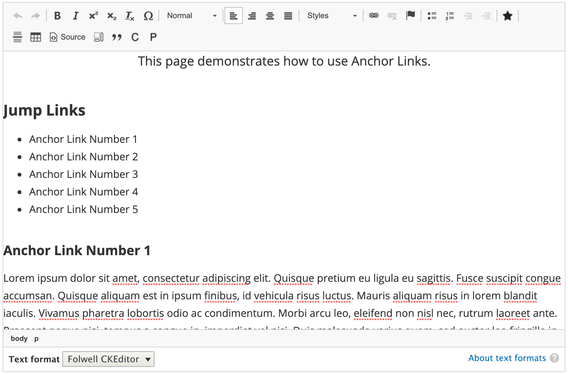
- Near the top of the page, or at least above the long text content that you want to link to, add in your “jump” links.
Creating the Anchors
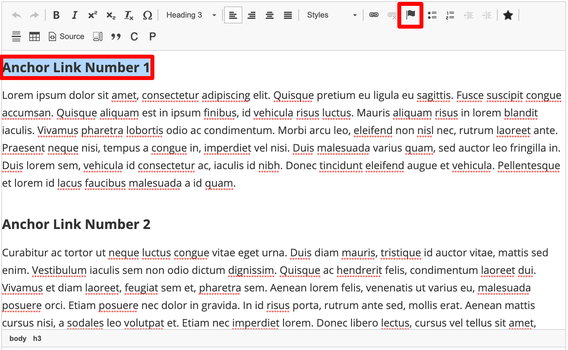
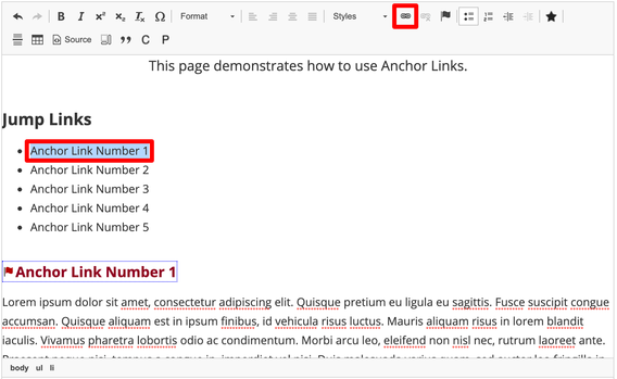
- Highlight the heading text and click the anchor link button (flag icon) in the toolbar.
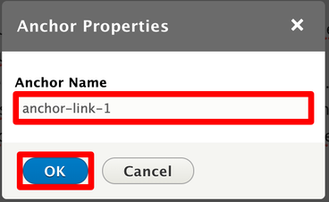
- In the new window that appears, type in a short, descriptive name for the heading in the Anchor Name field. The anchor name is usually a one word version of the heading. Click the “OK” button.
- For more complex pages that require a multiple-word anchor name, you can replace spaces with a hyphen. For example, heading text “Our History, 2001 - Present” could have the anchor text of “history-2001-present”
Note: Each anchor you create on the page must have its own unique name.
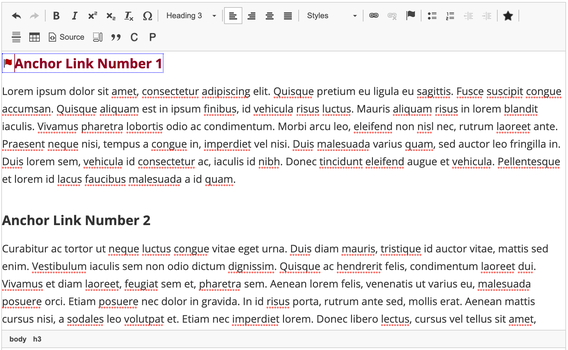
When the anchor link has been successfully created, it will look like this:
- Repeat the above steps for all the headings that you want to create “jump to” links.
Linking to the Anchors
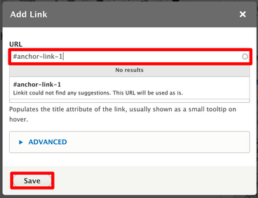
- Highlight the Anchor Link text, which should be near the top of the page, then click the link button in the toolbar.
- In the window that pops up, type in a hashtag/pound sign followed by the anchor name you created in step 2 above. Click the Save button.
Note: you must include the # symbol before the anchor name for it to work.
Do not put a space between the # symbol and anchor name.- Repeat the above two steps for each of your anchor links.
Adding Content with Layout Builder
By default, the Basic Page content type is just one column wide and one row tall—essentially, one single “block” of content. If your web page has more than one column, you will need to edit your web page with the Layout Builder found on the Layout Button. You can add rows, referred to as sections, and each section can have it’s own layout with columns of different sizes.
Adding a new section
- Open the Basic Page you wish to edit
- Click on the Layout button at the top of the page
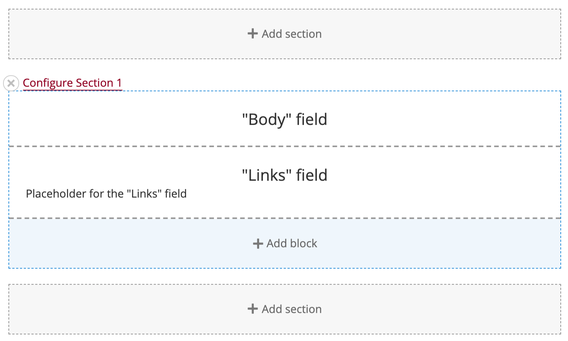
- Your page should look similar to this
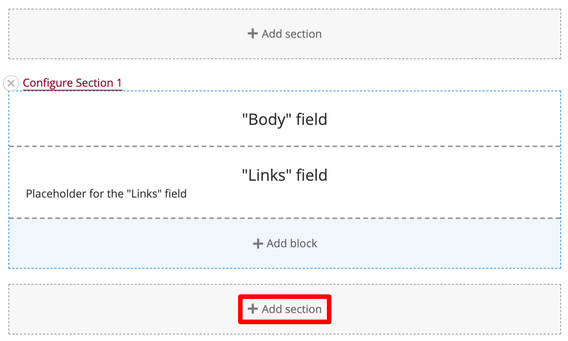
- You will be using two buttons within Layout Builder: Add section and Add Block.
- To add a row of content, click on the Add section button
Selecting a layout
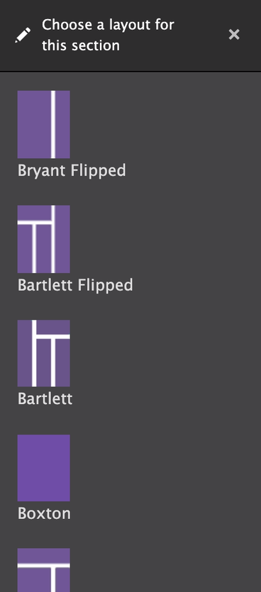
Once you click the Add section button, a new menu will appear on the right side of the screen. This menu shows all of the layouts you can choose from for this section/row of the web page. Be sure to scroll down—There are many layouts to choose from!
When reviewing the available layout options, look at the purple and white layout previews to see how many columns the layout will have and the size of those columns. Think about how your page’s content will need to fit into them and select the one that best fits the needs of your content.
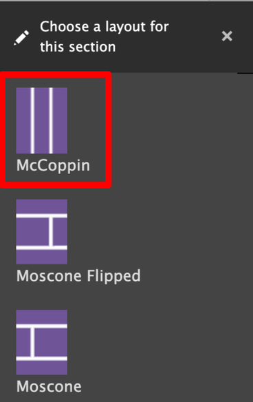
Click on the layout you want to use.
In this example, the McCoppin layout is used.
Optional: Naming the section
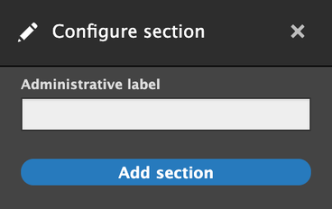
After you select your layout, a new screen will appear in the right sidebar that looks similar to this:
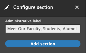
Naming the section is optional. You can leave it blank and click the Add section button, or you can label it as a reminder of what content you want to put in this section. It will not affect the display of the website to visitors, but will show a label when you are editing the page, like this:
Adding blocks to a section
A block is a piece of content that can be placed into a section. Most of the time, it will be a Folwell component, such as: accordions, callouts, images, and slideshows.
- Within the newly created section, pick a column you want to add content to and click Add block
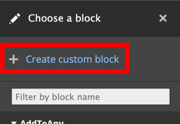
- Select Create custom block, found at the top of the list of blocks displayed in the right-hand column. The Folwell components are located in this section.
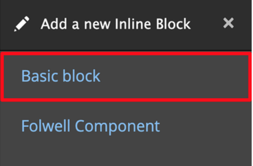
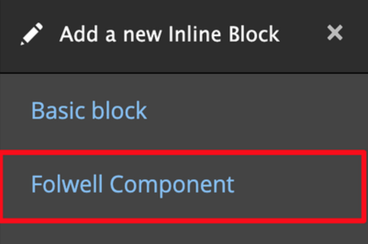
- Select one of the following:
- Basic block
- A basic block is a text box with the WYSIWYG options
- Folwell component
- A Folwell component adds any of the special Folwell components including accordions, callouts, images, and slideshows.
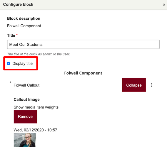
- Note that although each block requires a title, you can control the appearance of this title with the “Display title” checkbox located within the block.
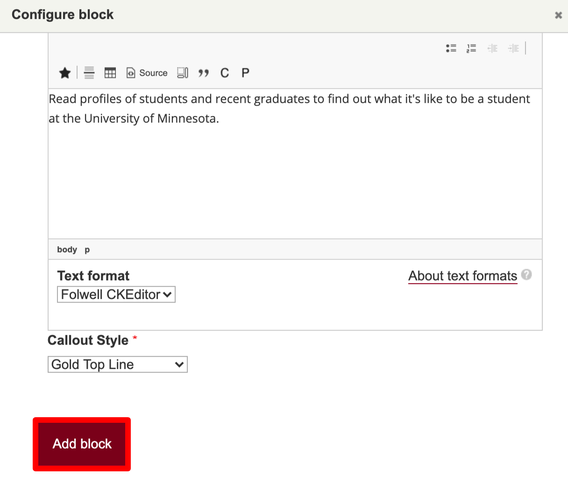
- Add your content and select the Add Block button.
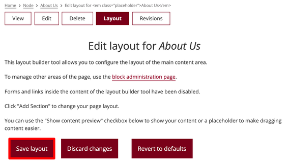
- Scroll to the top of the page and select the Save layout button.
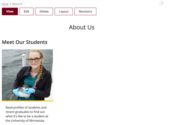
- You can now preview the new page layout and content that you’ve created!
Rearranging Sections
You cannot change the order of sections.
- To move a section of content on a page, use the Add section button to create a new section in the desired location.
- Once the section and layout have been created, drag and drop your existing content blocks to the new section’s content columns.
Deleting Sections
To delete a section and all of its content, follow the steps below.
Note: This action can not be undone! Content will be permanently deleted.
- Locate the section of content on the page that you want to delete
- Click the X button next to the section name
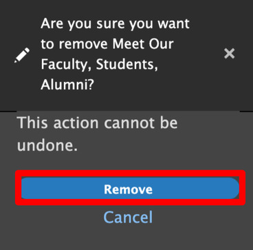
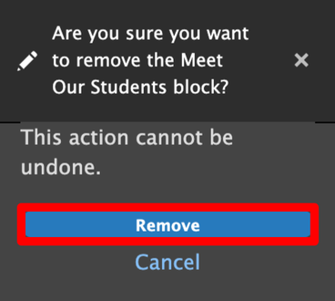
- A menu will appear on the right side of the screen confirming that you want to delete the content.
- Click the Remove button to delete the section and its content
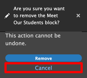
- Click the Cancel link if you wish to keep the section and its content
Rearranging Blocks
- Uncheck the Show content preview box found under the Save layout button at the top of the page to make this easier.
- Grab the box of content you want to move and drag and drop it to its new location.
Deleting Blocks
To delete a block, follow the steps below.
Note: This action can not be undone! Content will be permanently deleted.
- Hover over the block you want to delete. Click the edit icon that appears in the upper right corner.
- Select Remove block from the dropdown menu
- A menu will appear on the right side of the screen confirming that you want to delete the content.
- Click the Remove button to delete the section and its content
- Click the Cancel link if you wish to keep the section and its content
Adding Media
Images
Visit the Folwell Design System page to learn about adding images to your website.
Tip: If you are linking to an external site’s photo gallery, choose one of the following options:
- Create a slideshow of 3-5 of the most representative pictures from the gallery
- Display one picture from an image gallery site, such as Flickr, and provide a link to view the gallery.
Slideshows
Visit the Folwell Design System page to learn about adding slideshows to your website.
Tip: Crop your slideshow images to ensure they are the same size and dimensions.
PDFs and Documents Special Handling
The optimal solution for storing and updating PDFs and documents is to store them in your department’s Google Drive and link to the document’s URL. We recommend using a departmental account’s Google drive to share the document, because publicly sharing a file causes your name to be visible as the owner of the file.
Once they are added to Google Drive, you will need to update the settings to allow public access to view the documents..
- Update access settings to make it available to the public.
- Right click (PC) or control+click (Mac) the file and select Get Sharable Link
- in the "Get Link" section, adjust the link sharing settings by
- Select the caret next to Restricted
- Select Anyone with the link to allow anyone on the internet with this link can view
- Select the caret next to Restricted
- Copy the link it provides to use in Drupal.
- Add your link in Drupal and make sure to indicate the type of file in parenthesis. Example:
- Fact sheet (PDF)
Using Folwell Components
Folwell Components are the building blocks that tie University websites together while allowing for site-specific design elements.
Using Works for Faculty Profiles
The Works software tool allows for easier updating of faculty information to be displayed in staff lists and faculty profiles on your website. If your unit is not already using Works, we will connect you to the Works group for assistance with transitioning your information.

